

Happy Monday folks!
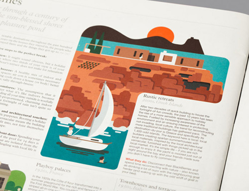
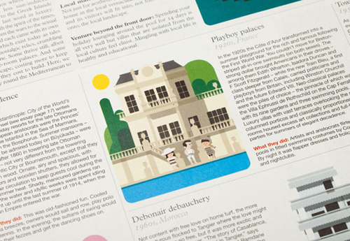
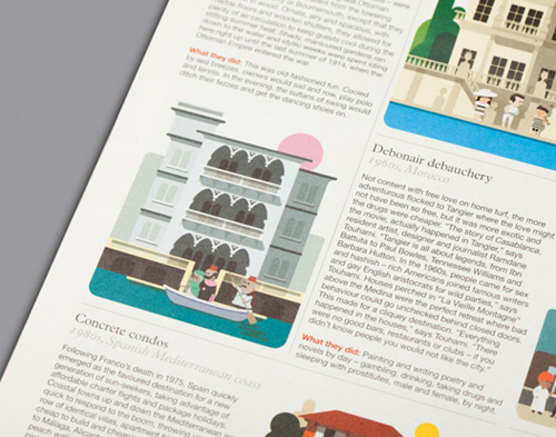
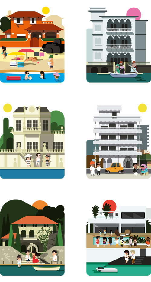
I saw this project by Barcelona-based designers Hey Studio for Monocle magazine and really like how they played with the layout of the article. It’s all in grid format, but the illustration broke up the monotony of the spread with its organic lines. Also look at how the top of each illustration doesn’t box itself up – lending a nice contrast to the hard lines of the text.


I love this work! So clever!