

I stumbled on Sarah Melling’s website quite by accident – she left a comment here (and I do check out each and everyone’s comment and website!) and found her beautiful illustrations done in color pencil. The layers on them are fantastic – my favorite is the one of chestnuts – that it almost seem to shimmer realistically. I found myself staring at them for the longest time, until I had to find out more about her process, as documented via this short interview that we had!
Read on!
Hi Sarah! Could you tell us a little bit more about yourself?
Hi Amy, I’m so happy to chat with you! Let’s see… growing up in Indiana, my box of 64 Crayola crayons was one of my prized possessions. I took lots of art classes in high school—back in an era when lots of art classes were still offered in high schools—and majored in Interior Design at Purdue University. (Well, I started out in Biology because I wanted to be Jane Goodall, but that’s another story.) After moving to San Jose in 1979 (yes, I’m that old), I worked as an interior designer and, after I decided to stay home with my kids, as a free-lance graphic designer. While those are both creative jobs involving a lot of drawing, I rarely drew for my own pleasure. Flash forward a few years, and I found myself with free time and a need to be creative.
I started visiting artists’ and illustrators’ blogs and my fate was sealed—I was more inspired with every click. But the one that got me off the computer and back to drawing was Paul Foxton’s blog, Learning to See Again. He was getting back to painting after a number of years, and his gorgeous still life sketches, as he learned to see as an artist again, just spoke to me. After a few months of drawing, I took the leap into the world of blogging last December, and it’s been so much fun. I love the community at Illustration Friday, and have made some wonderful online “pen pals” all over the world!

I love how realistic your illustrations are! Where did you learn to render your subject matter so intricately?
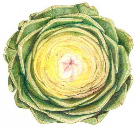
Thanks, Amy. I’ve always liked to draw, and have always been attracted to the more realistic art that many would consider illustration. (It’s a blurry line, isn’t it?) I especially love children’s book illustration and botanical/nature illustration. But I aim for a realism that stops short of that super-photo realistic look. I want my drawing to look like a drawing.
I have had a lot of good teachers, and the best advice for realistic drawing is “Draw what you see, not what you think you see.” And of course, it’s all about practice; I was definitely rusty when I started back up! I learned some techniques looking at books and online tutorials by colored pencil artists (there are many). The most helpful and inspiring book that I have, and I look through it often, is Ann Swan’s Botancial Portraits with Colored Pencils. It’s absolutely full of practical, step-by-step advice, and her work, while much more labor-intensive than mine will ever be, just takes my breath away.

Could you share with us a little bit about your process?
Well, I do want to mention that I almost never work from photos. To me, the whole point of drawing is looking at an object and making the image take that journey: eyes, brain, hand, paper. Whenever I’ve drawn from a photo reference, it looks flat. Some artists are very successful working that way, I’m not. (Although I really want to do some drawings of my chickens, and they never stop moving, so “never say never”, right?)
I usually set up my subject on my white desktop and light it with both daylight and my little drawing lamp, and really look at it before I start drawing. All of that stuff that one learns in drawing class comes to mind: “Where is the darkest point? The lightest? What shapes are made by the negative spaces?” I often work the details out with a sketch which I transfer to the nicer paper (with a lightbox or graphite paper) before I do the colored pencil piece. I am learning to layer colors a little better. Some colored pencil artists use a painstaking process where they layer a zillion colors to achieve that photo realistic product. I’m not that patient, but I do combine a lot of colors, and often experiment with little test swatches of key areas as I go.
I don’t draw digitally at all. I’m tempted, with all of the amazing new toys out there, but it’s much more relaxing to be unplugged. I do love the computer for cropping and things like that. When I scan or shoot drawings for my blog, I really try not to alter the tone or colors at all. I take a lot of time selecting just the right colors to use, so why negate that effort?
I know some of my readers would love to know what color pencils you use for your works (feel free to share if you’d like!)
I use good ol’ Prismacolor Premier colored pencils. I’ve used them since my high school days, I like how they feel and look, and they’re inexpensive and readily available. I asked my family for the whole set of 132 last Christmas, and I was like a little kid counting the days until Christmas morning. The first thing I did was to make a swatch chart of the whole set and it’s been invaluable; I use it constantly. I sometimes use the Prismacolor blending pencil to blend and burnish, and a little embossing tool to create fine lines that I want to remain white. (There’s a whole kerfuffle among “serious” colored pencils artists as to whether those two things make a drawing something other than colored pencil, but I think that’s silly.)
For graphite drawings, I mainly use Derwent Graphic pencils, mostly HB and 3B. That 3B pencil glides onto the paper like butter; I go through a lot of them.
And those are pretty much all that I use, which underscores why I love drawing; that simple elegance of putting pencils to paper.
{Thanks so much Sarah!}