Catch of the Day

I have to admit that I’m not adventurous with music. I like my playlists as they are, and any new music is one that I find through the radio, or through a recommendation through Spotify. The only way I’ll be able to accept new music if it’s been played at least 5 times – subliminal as it may sound.

BUT THEN.

I forgot about the days of MTV. And I realized how important images are when they go hand in hand with music – especially if the visuals are eye-catching illustrations that not only follow the beats of a sound, but enhances it too. I’m reminded of this through Catch of the Day music video; a song by Sally Seltmann and illustrated by Isobel Knowles who used stop-motion animation to produce the playful motions of the characters. And the catch? There was no brief.

From Dezeen:

[quote] “The animations are shot frame by frame using a camera and a light box,” Knowles told Dezeen. “I shot most of the elements separately and then composited them, changed colours and added effects digitally, layering up each scene from small parts.” [/quote]

It’s a beautiful work that warrants a watch – or 5. Happy Monday folks!

Inspiration: Prada Spring/Summer 2014

Prada Spring 2014

Prada Spring 2014

Prada Spring 2014

Prada Spring 2014

Prada Spring 2014

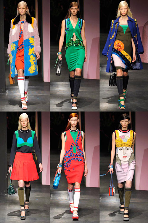
I was walking past Prada in Singapore when I chanced on their display window for the Spring/Summer 2014 line, and all I could do was to just stand there and take it all in. I think the exact response was a loud gasp and me clutching Mr. T’s hand in my stop-walking-because-I’m-going-to-ogle-this-for-5-minutes stare, along with me jabbing pointing excitedly at the window.

If you’re a regular here you’d know that I’m long drawn to abstracts and color, and the happiness that the combination of these two can create – hence my fascination with their current line. While it looks great on the store display, I wasn’t quite sure if all of the pieces are wearable in real life (yes, after I settled down for a bit) – some of it are a little too embellished and out-there for my tastes – I’ve always approached fashion interspersed with visual art with an eye that scopes out what looks editorial first and foremost. Having embraced color and pattern only for the past 5 years in my wardrobe has made me inch closer to wearing the colors and patterns that match the insides of my brain, but there’s only so far I’d go. I might need a bit more time!

The model’s accompanying boxy bags reminded me of small canvases that had somehow doubled as a bag too (though obviously less chunky), bringing the decoration of the female form to a complete artistic display.

I did a big of digging to see the entire collection online, and while I’m not a fan of some of their pieces (particularly the realistic portraits smacked center in some pieces and bags), I do adore the more minimalistic pieces, with their playful mix of color and abstracts. Also worth noting are the murals done up for the runway, done by muralists El Mac, Mesa, Gabriel Specter, Stinkfish, Jeanne Detallante and Pierre Mornet. It’s like the models were walking through a gallery!

From Elle UK:

[quote] Prada had commissioned these artists to do ‘something strong, to paint faces and bodies of women, but in the end they only painted faces, so I thought I had to provide the bodies’. And provide she did. [/quote]

[quote] This was an orgy of colour, embellishment, sportswear, streetwear, glamour, elegance and cool. What better way to zero in on female empowerment than to focus on the bra? They came festooned with jewels, embedded on coats in jet beading, worn over skinny sweaters with striped sporty ribbed collars and cuffs, as a bejewelled top in sunflower yellow, as a black detail on a green dress, or forming a scarlet bra-shape on an orange fur coat. [/quote]

[Images, top to bottom, referenced from: 1. Fabsugar 2. StyleBistro 3. Telegraph UK 4. CPP-Luxury

How to create great illustrations and comics

Brian Rea: Avoid This

I read a post by Seth Godin a couple of weeks ago, and in it, he mentions that:

“No one reads a comic strip because it’s drawn well.”

I almost yelled out a loud “YES!” (barred only by the fact that I was in a public place at the time) because that’s one of the main things I keep harping on and on about whenever I speak to students or people who tell me that their work isn’t good enough to be shown.

It’s not about coloring in the lines, nor making that perfect technically executed piece.

It’s not about making sure you’ve dotted out all your i’s and crossed all your t’s.

It’s not about comparing yourself to others, nor putting yourself up to impeccable standards set by others.

I’ve come across so many different illustrations, comics and graphic novels that might not be fit into the mainstream standard of “pretty” – but are powerful, thought-provoking and edgy. Here are a few examples:

Brian Rea: Avoid This

Avoid This – a collection of illustrations by Brian Rea (who also regular on the NYTimes, illustrating a segment called Modern Love)

Hyperbole and a half

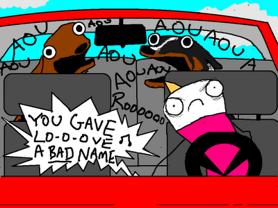
Allie Brosh illustrates how dogs don’t understand basic concepts at Hyperbole and a Half

Amanda Vähämäki : The Bun Field

Excerpt from The Bun Field (published by Drawn & Quarterly) – a collection of five stories by Amanda Vähämäki

Kate Beaton

Historical figures with a twist of humor by the inimitable Kate Beaton

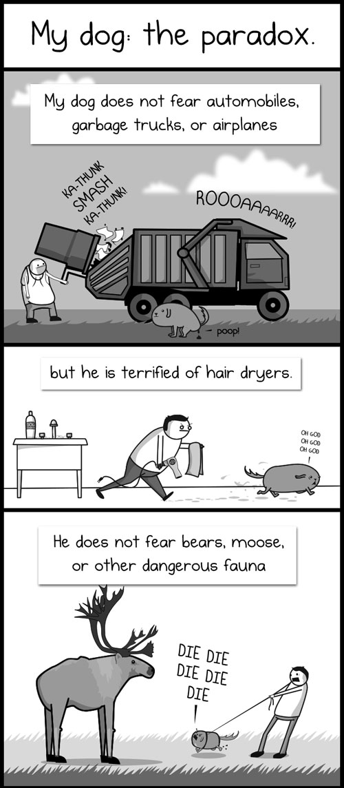
The Oatmeal - My Dog: The Paradox

The Oatmeal – a webcomic by Matthew Inman that pokes fun at almost everything under the sun.

Ryan North - Dinosaur Comics

Ryan North draws dinosaurs that talk in Dinosaur comics

Cyanide & Happiness

Rob DenBleyker for Cyanide & Happiness

It’s all about the story behind them that makes them stand out. 

Just think about it:

What makes you want to scribble your thoughts down so quickly that you don’t mind the messiness of the process? What experiences, thoughts and things that you want to say that you find yourself continuing your lines right off the edges of your sketchbook – just so you won’t have to turn the page and lose that train of thought?

What propels you get your ideas out there as fast as possible?

Great illustrations/stories/comics start with ideas first, execution second. If your idea doesn’t resonate with others, no amount of great execution can help – and on the other hand, if you have a great idea, execution is secondary to the transmission of the idea itself.

Your fans (or non-fans) will figure it out sooner or later, no matter if it’s the former or the latter.

More: Cyanide & Happiness

——————————-

If you like reading this post, think of all the goodness you could miss out on, just because you’re busy! I’ll make it easy for you to keep up by sending you an email once a week when I write something new. Cool? You can sign up over here!

1 26 27 28 29 30 74