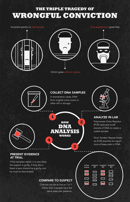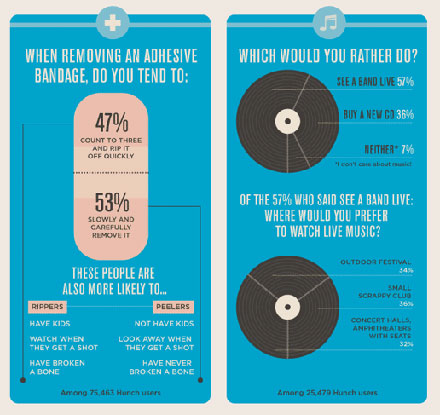
We live in an age where pretty is the standard for all things. Even things like boring ol’ data is made sexier – and we’re not talking about mere candy striped bar-graphs and rotund piecharts. We’re talking the data design, which ends up as infographics that you see around these days.
I’m all for making learning easier – which is why I scrutinize information closely when they’re properly presented. While there are many excellent examples of infographics around, there is the occasional overkill that brings together a pastiche of data with inappropriate graphics.
Yes, I’m THAT serious about how data is presented.
So for those who are interested, I have a short personal list on what makes for good infographic, and is mostly based on me imagining myself as the end user, so it’s best to take my advice with a grain of salt!

Tip 1. Make it relevant.
If an element doesn’t belong or illustrate a point, it does not belong there. And no, just because you made it pretty does not count.
Tip 2. Connect points clearly to illustrate your point.
Do not ramble – present your facts, lay out the statistics and follow through with a clean summary.
Tip 3. Keep it short.
Brevity is sexy.
Tip 4. Remember to lead the eye.
Infographics is a form of graphic design – so observe the principles of good design.
Tip 5. Keep it simple
Simple is so subjective. When I say simple, I don’t mean stripped down, all-white, minimalistic nor blah. If I understand what you’re trying to say at first glance (or even when I’m through), you’re halfway there!
“Perfection is achieved, not when there is nothing more to add, but when there is nothing left to take away.“
~ Antoine de Saint-Exupéry

And lastly, I’d love to see more hand-drawn illustrations featured in infographics – I think they would add much needed character to data-driven design, don’t you think so?
{Images taken from the Daily Infographic – a fun site filled with infographics!}


